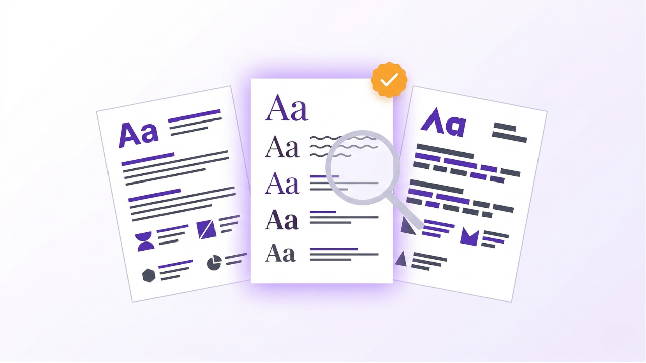
Font choice on a CV is one of those decisions that feels small until you send 50 applications and wonder why none get read. The wrong font can make your CV look dated, hurt readability, or even fail ATS parsing. The right font makes your CV look credible at a glance.
This guide covers the 10 best fonts for your CV in 2026, the right sizes to use, and which fonts to avoid at all costs.
Why Font Choice Matters
Your font affects:
- Readability (especially on mobile, where recruiters scan CVs)
- ATS parsing (unusual fonts can cause parsing issues)
- First impression (dated or unusual fonts signal unprofessionalism)
- Space efficiency (some fonts let you fit more text without looking crammed)
In 2025, Enhancv surveyed 25 recruiters and found 92% said ATS systems do not auto-reject for formatting, but fonts still affect how clearly both software and humans read your CV.
The 10 Best Fonts for Your CV
Sans-serif fonts (modern, clean, great for digital viewing)
Microsoft Word's default since 2007. Widely compatible, excellent on-screen readability, and parsed cleanly by every major ATS. Safest overall choice.
Ubiquitous and neutral. Works on every device and every operating system. A solid fallback if you want zero risk.
Popular in design-heavy industries. Clean and modern, though slightly more formal than Calibri. Mac users have native access; Windows users may see it substituted automatically.
The new Microsoft default, replacing Calibri. Modern, clean, and designed specifically for both screen and print. Increasingly recognised by ATS systems.
Modern, friendly, and slightly distinctive without being unusual. Popular for creative and tech roles.
Designed for screen readability. Slightly wider letter spacing, which takes up more space but reads very clearly at smaller sizes.
Serif fonts (traditional, formal, great for print)
Classic and professional. Works well for finance, law, academia, and traditional industries. Slightly more compact than other serif options.
Designed for on-screen reading. Popular alternative to Times New Roman with better readability.
Another Microsoft default. Combines the formality of a serif with modern spacing. Safe for most industries.
Traditional but increasingly dated. Still parses fine in ATS and is universally available. Use if you are in a traditional sector (law, academia) and want to play it safe.
Quick Font Recommendations by Industry
Best Font Sizes for Each Section
The rule: Never go below 10 pt for body text. Anything smaller is hard to read and signals that you are cramming content.
Font Pairing Tips
You can use up to 2 fonts on a CV: one for headings, one for body text. More than that and it looks busy.
Strong pairings
- Calibri (body) + Calibri Bold (headings): Safe single-font approach
- Georgia (headings) + Calibri (body): Serif + sans-serif contrast
- Garamond (headings) + Garamond (body): Traditional single-font
- Helvetica (headings) + Helvetica (body): Modern single-font
What to avoid
- Mixing two serif fonts (too busy)
- Mixing decorative fonts with professional ones
- Using more than 2 fonts on a single CV
Fonts to Avoid on Your CV
1. Comic Sans
Widely considered unprofessional. Avoid in all professional contexts.
2. Papyrus
Novelty font, no place on a CV.
3. Script fonts (like Lucida Handwriting)
Hard to read and often fail to parse in ATS.
4. Highly decorative fonts
Anything designed for posters or headlines does not belong on a CV.
5. Impact, Arial Black
Too bold and heavy for body text.
6. Courier and monospace fonts
Uneven character spacing makes CVs look dated and hard to read.
7. Fantasy or game-themed fonts
Only acceptable for very specific creative niches, and even then risky.
ATS and Font Compatibility
Most ATS systems parse the following fonts reliably:
- Calibri
- Arial
- Times New Roman
- Georgia
- Garamond
- Verdana
- Tahoma
- Cambria
Less common fonts (like Aptos, Lato, or Open Sans) usually parse fine too, but the safest bet for maximum ATS compatibility is to stick with the first three: Calibri, Arial, or Times New Roman.
What can break ATS parsing:
- Unusual or decorative fonts
- Fonts embedded as images
- Very small font sizes (below 10 pt)
- Text in headers or footers
- Text inside tables or text boxes
Bold, Italic, and Underline: When to Use
Bold
Use for:
- Section headings
- Job titles
- Company names
- Key achievements or metrics (sparingly)
Italic
Use for:
- Company descriptions (optional)
- Publications or article titles (academic CVs)
Underline
Generally avoid. Underlines date your CV and are often confused with hyperlinks. If you need to emphasise something, use bold instead.
Practical Font Guidelines for Different CV Types
For first-time job seekers
Stick to Calibri or Arial at 11 pt. Save creative font choices for after you have more experience to show off.
For more on first-time CVs, see our student CV guide.
For technical roles
Sans-serif fonts (Calibri, Aptos, Lato) work best. Modern and clean suits tech, data, and engineering industries.
For traditional industries
Serif fonts (Garamond, Cambria, Georgia) signal professionalism in finance, law, and academia. Keep everything else clean and conservative.
For creative roles
You have more latitude here. Modern sans-serif (Helvetica, Lato) or clean serifs (Georgia) both work. Avoid the temptation to use decorative fonts to demonstrate creativity; use layout and content for that instead.
How to Check Your Font Choice
1. Print and check
Print your CV. Does every word read clearly? Is the hierarchy clear? If you cannot read it comfortably from 18 inches away, the font size is wrong.
2. View at different sizes
Open your CV PDF and zoom to 50%, 100%, and 150%. Make sure it reads well at all sizes, since recruiters may view on phones, tablets, or desktops.
3. Test on different devices
Your CV can look great on your laptop and terrible on a phone. Check it on mobile too.
4. Check with a colleague
Fresh eyes catch issues you have stopped seeing. Ask someone to review it for readability.
Frequently Asked Questions
Is Times New Roman still acceptable?
Yes, especially in traditional industries (finance, law, academia). It is slightly dated but it parses reliably and is universally available.
Should I use the same font as my cover letter?
Yes. Consistency across your CV summary, cover letter, and motivation letter looks more polished.
What if I want to stand out with an unusual font?
Do not, at least not through font choice. Stand out through strong content, quantified achievements, and clean formatting. Unusual fonts read as novelty, not originality.
Is 10 pt body text too small?
It is the lower limit. 11 pt is safer. Only go to 10 pt if you truly need to fit content. If you are struggling for space, see our CV length guide.
What about the font in my file name?
Not relevant to fonts, but a reminder: save your CV as "First_Last_CV.pdf" rather than "resume_final_v3.docx."
Can I use different fonts for my name vs body?
Yes, a different (usually larger) treatment for your name is fine, but keep it to the same font family. Big Calibri for the name and regular Calibri for the body is cleaner than mixing two different fonts.
Key Takeaways
- Best overall choice for most roles: Calibri at 11 pt
- Use 18-24 pt for your name, 12-14 pt for section headings, 10-12 pt for body text
- Sans-serif fonts (Calibri, Arial, Aptos) work best for tech, startup, and creative roles
- Serif fonts (Garamond, Cambria, Georgia) work best for finance, law, academia
- Avoid Comic Sans, Papyrus, script fonts, and anything decorative
- Use bold for emphasis; avoid underlining and excessive italics
- Test your CV on different devices and at different zoom levels